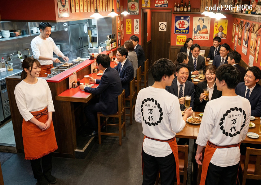
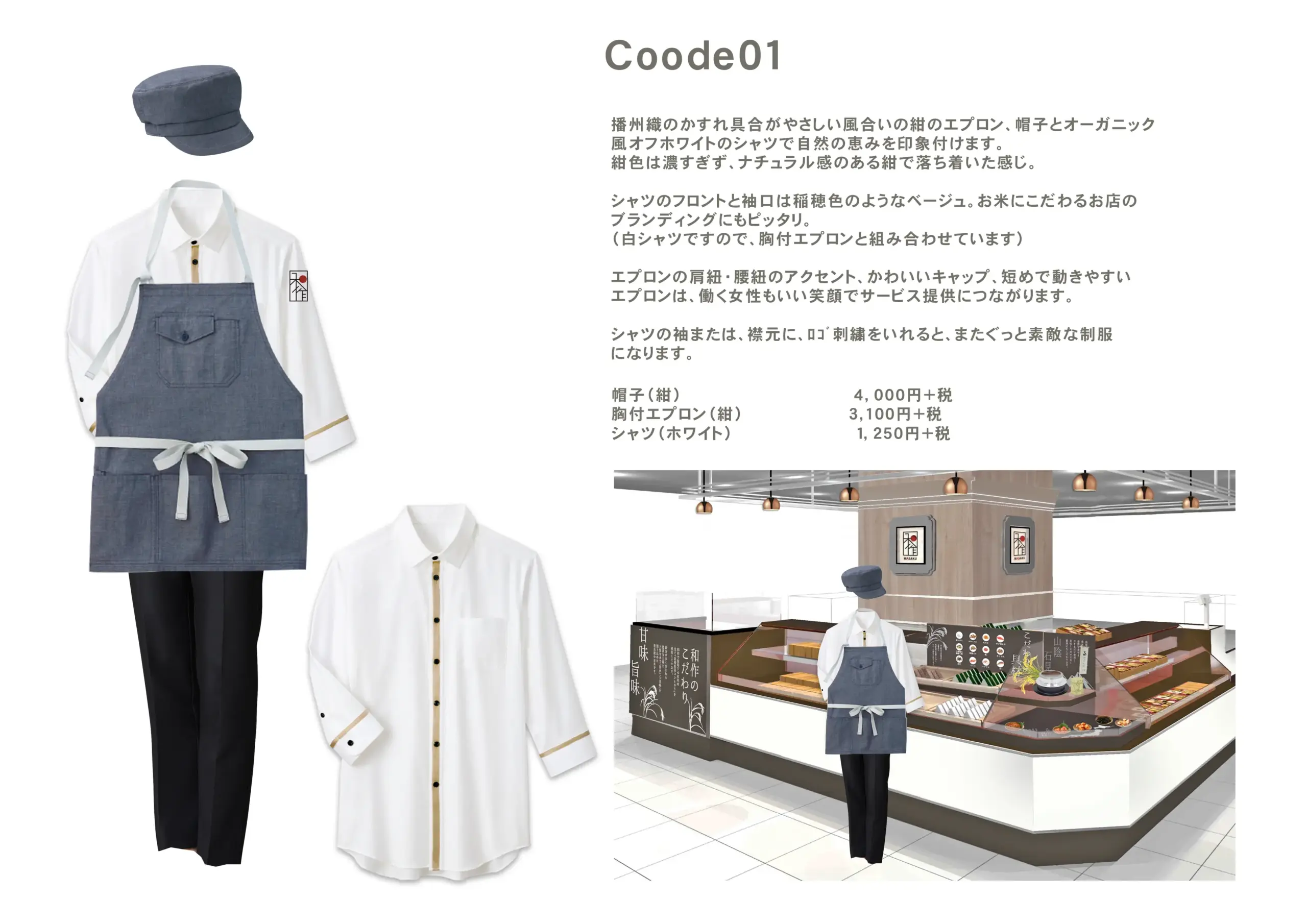
飲食店サービス制服コーデ 昭和レトロ居酒屋×にぎやか親しみやすい×低価格帯料理提供 庶民的居酒屋コーデ【codeF26-H006 】
居酒屋制服ユニフォーム
昭和レトロで、いつもそこにあった懐かしい雰囲気の庶民的な居酒屋。「入りやすさ+覚えやすさ+活気」「一発で“昭和居酒屋”とわかる」元気で活気のある制服コーデ。元気な昭和といえば、帆前掛け。赤系の橙の帆前掛けにTシャツに背中に大きなプリントでお店は一挙に元気になります。入ったらみんな元気になる、そんな飲食店制服コーディネート。
店舗業態(細分類):昭和レトロ居酒屋
雰囲気 親しみやすい
客層(年齢、性別) サラリーマン層
利用目的 宴会・大人数
価格帯 低価格(大衆)
行動特性 にぎやか(活気重視)
にぎやかな笑い声と活気あふれる空気感が魅力の昭和レトロ居酒屋に最適な、親しみやすさとインパクトを兼ね備えたコーディネート提案です。飲食店において、第一印象で「入りやすい」と感じてもらえるかどうかは非常に重要な要素。本コーディネートは「入りやすさ+覚えやすさ+活気」を軸に設計されており、サラリーマン層を中心とした宴会・大人数利用のシーンにおいて、自然と場が盛り上がる空間づくりをサポートします。
ベースとなるのは、清潔感のある白のTシャツ。背面には店舗ロゴを大胆に配置することで、シンプルでありながらも記憶に残るデザインに仕上げています。動きやすく軽快な着心地は、ホール・キッチン問わず忙しい現場でもストレスなく着用でき、スタッフ全体のパフォーマンス向上にもつながります。カジュアルな印象を持たせつつも、統一感のあるビジュアルで店舗の一体感を強く演出できるのが特徴です。
そこに組み合わせるのが、鮮やかな赤の前掛け。視覚的に強いインパクトを持つ赤は、昭和レトロな空間との相性が抜群で、店内全体に活気とエネルギーを与えます。また、赤は食欲を刺激する色でもあり、飲酒中心のにぎやかなシーンにおいては非常に効果的。お客様同士の会話やスタッフとのコミュニケーションも自然と弾み、「また来たい」と思わせる雰囲気づくりに貢献します。
さらに、前掛けは耐久性に優れた素材を採用しており、汚れが付きやすい飲食店の現場でも安心して使用可能。使い込むことで味わいが増し、店舗の歴史やこだわりを感じさせるアイテムへと育っていきます。低価格帯で導入しやすい点も大きな魅力で、大人数のスタッフを抱える店舗や新規オープン時のコスト管理にも最適です。
全体として、白と赤のコントラストが明快で、一目で「昭和レトロ居酒屋」と認識できる視覚的なわかりやすさを実現。落ち着いた雰囲気を持ちながらも、どこか懐かしく温かみのある空間に溶け込みつつ、おしゃれなコーディネートとしても成立しています。リーズナブルな制服アイテムを使って、シンプルでありながらしっかりとした存在感を放ち、飲食店としての個性とブランド力を高めるユニフォームです。
このコーディネートは、単なる作業着ではなく、店舗の世界観を体現する重要な要素。昭和レトロな魅力を最大限に引き出しながら、親しみやすさと活気を同時に演出したい飲食店におすすめの一着です。
This uniform coordination is designed for a lively, retro-style Japanese izakaya, combining approachability, memorability, and energy. In the food and beverage industry, creating an inviting first impression is essential, especially for restaurants targeting business professionals looking for a casual and enjoyable dining experience.
The base of the outfit is a clean white T-shirt featuring a bold logo on the back. This simple yet impactful design enhances brand recognition while maintaining a casual and approachable look. The lightweight and comfortable fabric allows staff to move freely, making it ideal for busy environments with high customer turnover.
Paired with the T-shirt is a vibrant red apron, which plays a key role in defining the overall atmosphere. Red is a powerful color that symbolizes energy and excitement, perfectly matching the lively nature of a retro izakaya. It also stimulates appetite and encourages social interaction, helping to create a warm and engaging dining experience.
The apron is made from durable materials suitable for demanding restaurant operations. Over time, it develops a unique character, adding to the authentic charm of the establishment. Its affordability also makes it a practical choice for restaurants with a large number of staff.
The strong contrast between white and red creates a visually striking look that instantly communicates a “retro Japanese izakaya” concept. While maintaining a relaxed and nostalgic feel, the coordination also delivers a stylish impression, making it both functional and visually appealing.
More than just workwear, this uniform represents the identity of the restaurant. It is an ideal choice for establishments seeking to create a friendly, energetic, and memorable dining environment.


その他のコーディネート
-
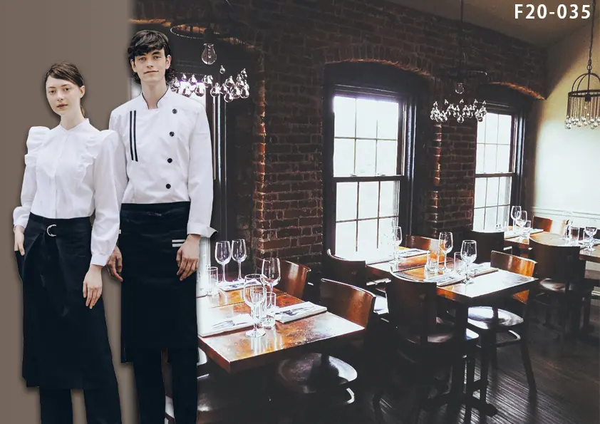
F20-035 飲食店制服コーディネート 暗めの店内でレンガやシャンデリアなどインテリアにこだわった大人が集うお店にオススメのコーディネート
洋風レストラン制服ユニフォーム -
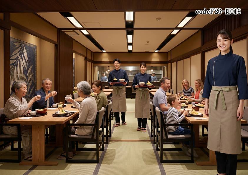
飲食店販売店制服コーデ 和食×うなぎ店×高級感×ネイビー|高級感ある鰻専門店におすすめの制服・ユニフォーム|ネイビー×ブラウンカーキで魅せる和風コーディネート【codeF26-H019】
和食・小料理店制服ユニフォーム -
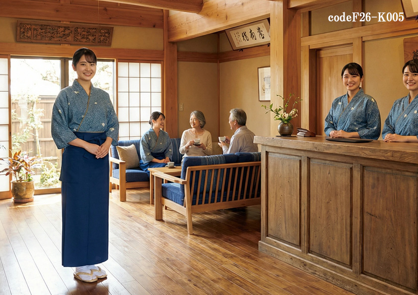
飲食店ホテル・サービス制服コーデ 旅館×高級感 インバウンド対応の高級旅館に映える和装制服|高級旅館ユニフォームコーディネート【codeF26-K005】
和食・小料理店制服ユニフォームホテル旅館・観光制服ユニフォーム -
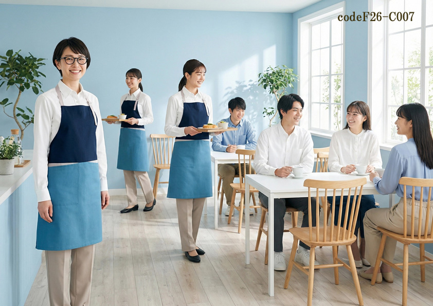
飲食店サービス制服コーデ リゾートカフェ×明るい×青ブルー|爽やかなブルー×ネイビーでつくる海辺カフェコーデ【codeF26-C007】
カフェ制服ユニフォームスタイル -
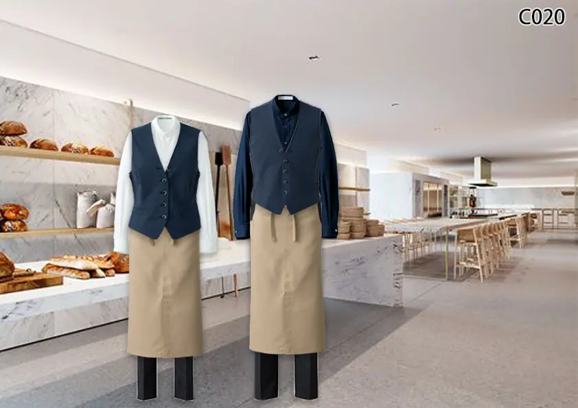
C020 白を基調とした高級感のあるカフェやホテルバイキングにオススメ★カジュアルベストスタイル
カフェ制服ユニフォームスタイル -
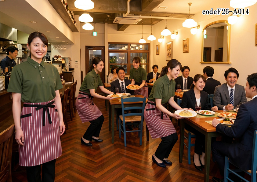
飲食店販売店制服コーデ イタリアン×ランチ特化×カジュアル×赤|活気のあるカジュアルユニフォームコーディネート【codeF26-A014】
洋風レストラン制服ユニフォーム -
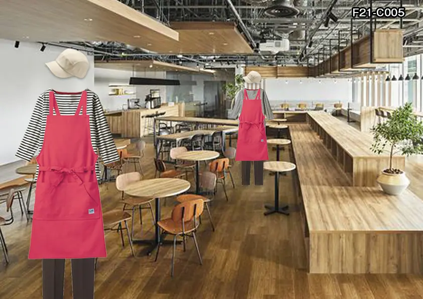
F21-C005 飲食店制服コーディネート 木をふんだんに使った子連れでゆっくりできる居心地のいいカフェに、元気なスタッフがニコニコ働ける元気な赤いエプロンを使ったコー
カフェ制服ユニフォームスタイル -
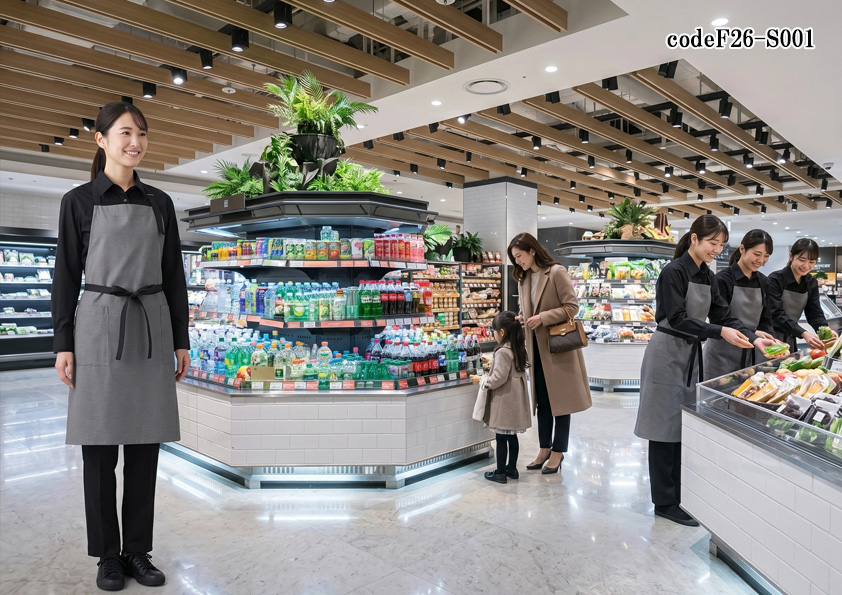
飲食店販売店制服コーデ 食品スーパー×高級×モノトーン|グレー×黒で魅せる高級食材売場のおしゃれなユニフォームコーデ【codeF26-S001】
食品スーパー・販売店制服ユニフォーム -
cd202203 食品販売店制服
-
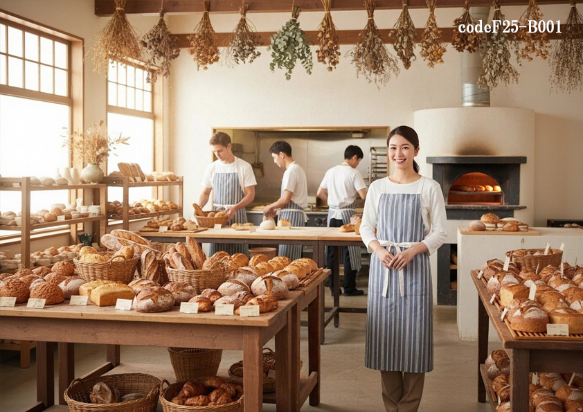
飲食店サービス店舗制服コーデ ベーカリーパン屋×ナチュラル×北欧風|おしゃれで清潔感あるストライプ胸付きエプロンユニフォームコーデ【codeF25-B001】
パン・ベーカリー制服ユニフォーム
